
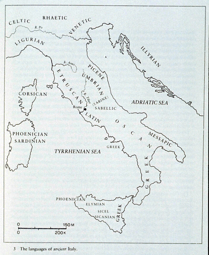
It’s become a bit of a cliche for me that my academic talks tend to start with a map of the languages of Italy, followed by an explanation of why the map is dangerously misleading. The map that I normally use is from Wikipedia, and looks like this:

Now, this map does the job in many circumstances. It gives a rough indication of the location and extent of the languages of ancient Italy, taking a point around the fifth or fourth century. But – as I’m sure everyone is getting tired of hearing me say – there are some problems here too. The map gives the impression that there are clear borders between the languages, and that there was no bilingualism or language contact. It also buys into the Roman idea of large ‘tribes’ speaking the same language across wide areas, rather than individual communities and city states each doing their own thing. If we’re not careful, the map also gives the impression that these boundaries were static and unchanging – who would guess from this map, for example, that Etruscan extended down to Campania at its greatest extent?
Some of my colleagues prefer to use maps that looks something like this instead:
This kind of map is more honest to some extent, since it gives a general impression of where each language is found without suggesting that we know exactly where the borders between languages. It also leaves some blank space in places, where there’s little or no evidence. But otherwise, it has the same problems as the first map – large areas each given one language, with no clear evidence of contact or change over time.
Until recently, I’ve contented myself with complaining about existing maps – but I’ve realised that for my Language Contact in Ancient Italy project, just poking holes in other people’s work is not going to be sufficient any more. And so, I’ve been making some maps.
The first task was to create a spreadsheet (or rather, a lot of spreadsheets…) which gave the locations and dates of all the inscriptions in Italy. There’s no one book that has this information, so it takes a certain amount of time to collate the information from lots of different sources. Fortunately, I’d done a lot of that work for previous research anyway.
Step two was getting all that information onto a map. Google maps is fairly handy for this kind of thing – here’s a screenshot of what all that information looks like:
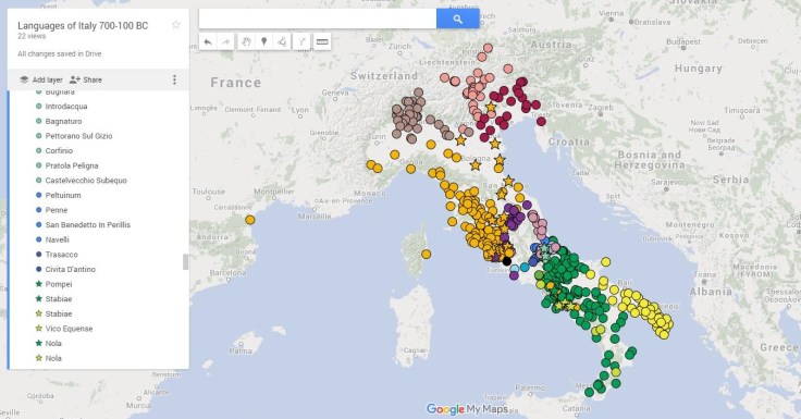
On this map, every colour represents a different language (more or less). Dots show sites where that language is present. Stars show sites where there is more than one language present (at any period, not necessarily at the same time).
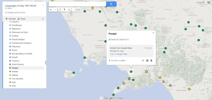
If we zoom in on a particular area, such as the Bay of Naples, you can see that if I click on a dot or star, you get some additional information about the languages and the time periods when they appear. So, if I click on Pompeii (a star), it will tell me that the languages there are Etruscan and Oscan.
So far so good, but still not the easiest way of visualising all the information. I decided that I also wanted a clearer map of all the languages for the whole period, but also maps for each century to show the change over time. For this, I had to put the same information into publisher, so that I could get the images looking as nice as possible. These images now look like this:

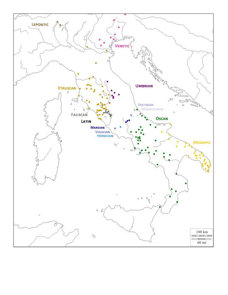
These images are much less interactive than a Google map, and with less information – but I’m hoping that people will eventually be able to use the two together. At some point I might even make a little animation of the century-by-century images, to show the changes over time.
All of this might seem like just gathering existing information together rather than creating anything new, but it’s already made me much more familiar with languages I know very little about, and given me a fresh perspective on the regions I thought I knew quite well. And for me, the insight into our evidence for ancient languages is completely worth the effort. On these maps, you can see that our evidence exists only as dots on a map – lots of blank space, lots of unknowns, and lots of overlaps.
So what is there left to do? Well, you might notice that Greek and Latin are conspicuously absent, apart from the black dot where I’ve marked in the city of Rome. (Is it a telling indication of my subconscious feelings about Latin that I’ve given it the Black Spot?) My next task will be to put together a list of the Latin inscriptions of Italy up until around 44 BC which – I’m hoping – shouldn’t actually take too long, given how many are found in and around Rome. Still, there’s plenty of Latin, and it will take a little while to put the evidence together.
Greek is potentially a more difficult task, since there the relevant inscriptions are spread among many more sites and publications. But I’m very luck that our PhD student Livia has a working list of all the Greek inscriptions in Italy that she is letting me use. So hopefully before too long I’ll have a finished and functional set of maps to share.
If you’d like to play around with the Google map, please do – I’m hoping that eventually these maps will be resources available for everyone to use. And let me know below if you spot any mistakes or would like to request any additional features that would be particularly helpful. I’ve also made an effort to make these maps easy to use for colour-blind readers, but if that applies to you and there are sections of the maps which are unclear, please let me know.
Also posted on the Greek in Italy project blog
Images and KML data created by me are available under a CC BY-NC licence.


Sure: Creative Commons Attribution + Noncommercial (CC BY-NC). I’ll make that clear above.
If anyone wants the images or data for something commercial, they can ask.
LikeLike
Is there any kind of license on the KML data?
LikeLike
Thanks! I’ve used the AWMC maps before, but they never quite had what I wanted.
Definitely going to check out the Google Earth timeslider now…
LikeLike
Thanks! I’ll check out those sites too. I’ve made little animations before using Powerpoint, which works ok, but the gif thing sounds great.
LikeLike
Great work 🙂 In addition to Google Maps you might want to check out the free map tiles produced by Johan Åhlfeldt and AWMC.
http://awmc.unc.edu/wordpress/tiles/
http://pelagios-project.blogspot.co.uk/2012/09/a-digital-map-of-roman-empire.html
Google Earth also has timeslider functionality if you assign date ranges to entities in your KML.
LikeLiked by 1 person
“At some point I might even make a little animation of the century-by-century images, to show the changes over time.”
Fortunately, there are lots of free websites out there that make this really easy to do! E.g. imgflip.com/images-to-gif and makeagif.com. If there were a way to filter by date in the Google map, anybody could generate it from cropped screenshots.
Anyhow, I mostly just wanted to comment to say this is super cool, since it can be hard to tell how well a blog post received is without comments.
LikeLiked by 1 person
Very clever – and a lot of hard work. We’re using something similar to produce dialect maps (for modern day Gaelic), so I can appreciate the effort!
LikeLiked by 1 person