
First of all – happy second birthday, blog! The blog is now regularly getting 2000 readers a month which – let’s be honest – is a lot more people than have read my book in the same period, and that’s why I love blogging. It’s been great to publish my work in different ways and to reach a wide variety of readers across the world. Thanks to all of you for reading, and thanks to everyone who has got in touch in the last year to tell me that they’ve been enjoying the site. It’s a real pleasure!
Yesterday, I had a great day drawing some illustrations for the article I’m currently writing, and I decided to live-tweet the process. I’ve drawn illustrations for a few of my publications, and I’ve developed a reasonably reliable process by trial-and-error, and by keeping in mind a few of the great tips I learned at the British School at Athens epigraphy course back in 2011.
Sometimes people are surprised to learn that epigraphists often still draw inscriptions by hand. I’m sure that if I was doing hundreds, I would have learned to do them using the computer somehow. Since I only do a couple a year, this process works for me. It also requires no real talent for drawing, fortunately – just a quiet, light place to work, some appropriate pens (I use Stabilo .88), a printer, and a reasonably steady hand. There are doubtless better methods out there, so please feel free to comment and tell us about your techniques for drawing inscriptions or other artefacts.
I always start by taking a lot of photographs of the inscription I want to draw. It’s really essential to have both close-ups of the detail and photos of the whole object. I took these photos at the Museo Nazionale Atestino in March 2015.

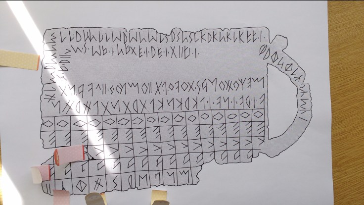
I picked one of the clearest photographs of the whole inscription, and printed it out at about A4 size. This means the final line drawing will also be about A4 size, which is great for any future reproductions I might make, as it means I’ll know I can always copy it that large without loss of quality. I printed the image out at a couple of different brightness levels, as I wasn’t sure which would work best for this particular inscription.

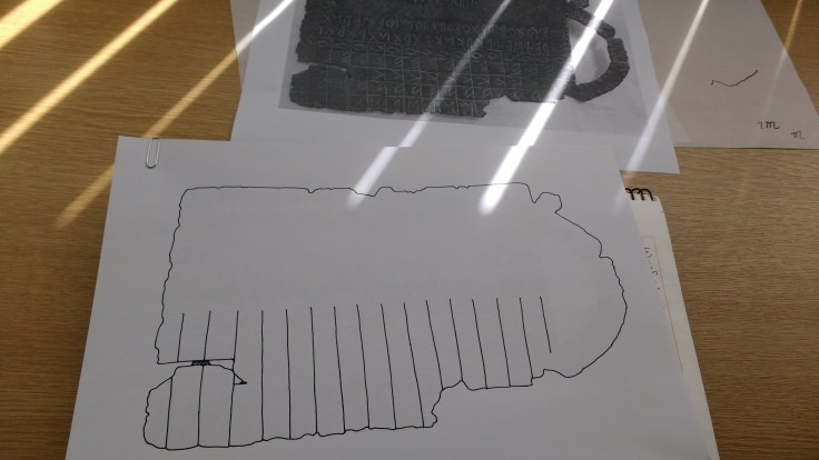
The first step is to draw directly onto a print-out to make a clear outline, which I can then trace to produce a line drawing. I decided the lighter version would be best for this, so I made a start.

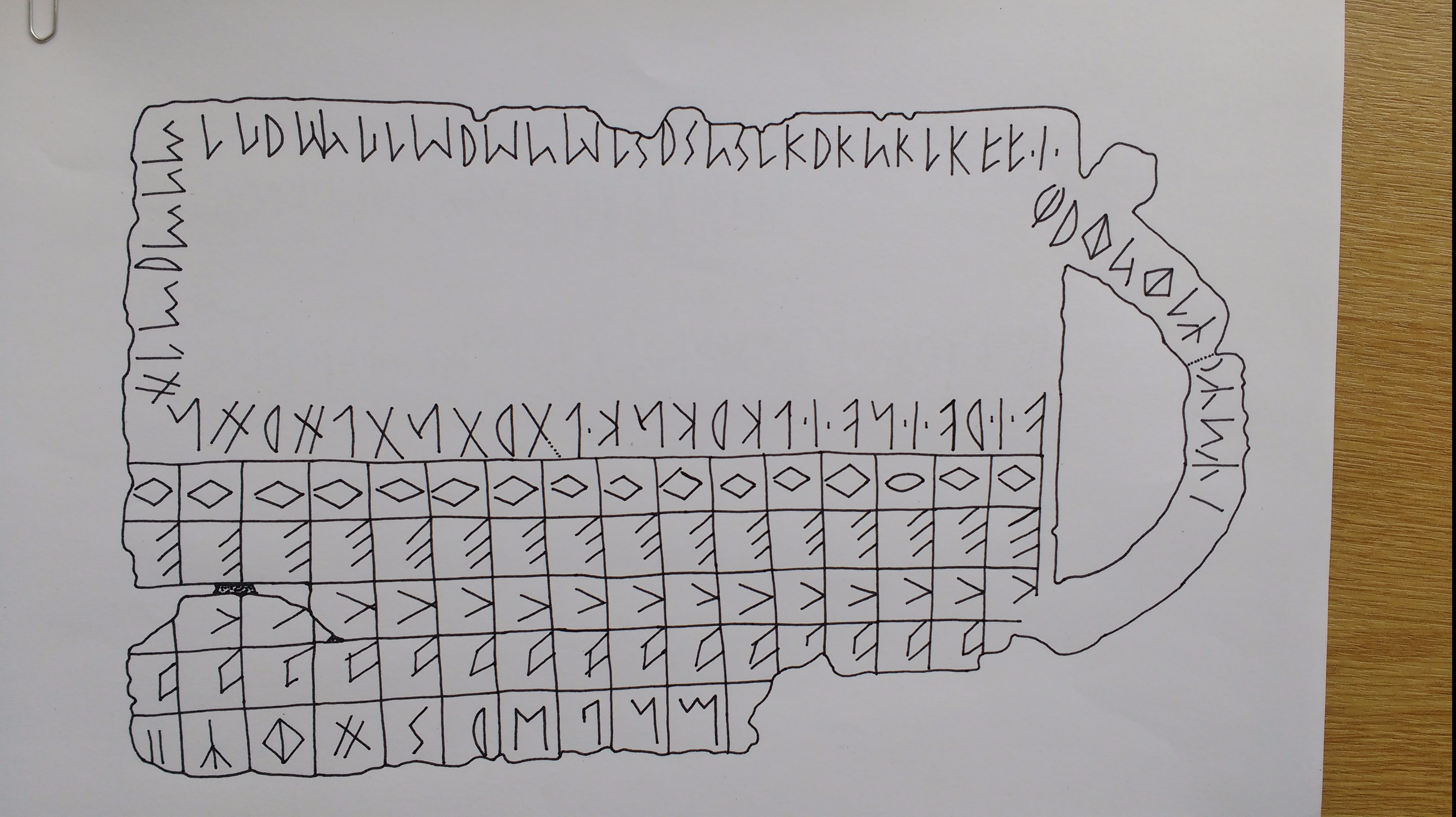
By drawing very carefully onto the image itself, I can be really accurate. I still needed to refer to the photographs on my computer, especially the close-ups of particularly difficult letters, as some areas of the print-out weren’t clear. That’s fine – you can never get a single photograph that shows every letter of an inscriptions perfectly, which is why drawings are important.
Damage to different areas of an inscription can make things particularly difficult, as it can be hard to tell what is a deliberate mark on the bronze and what is damage. Inscriptions often break along the lines of the letters (where the surface is weakest), so that can obscure some characters. Writers also make mistakes, so you should never be tempted to write the letter you think should be there – there’s a good example on this inscription where the writer has started an M and then corrected it to a P. That kind of thing is obviously interesting in itself, so it’s important not to erase it from your record.
I always keep rotating the paper to make it as easy as possible to draw accurately. This often means viewing letters upside-down or sideways, but that’s totally fine – in fact, it’s often better if you start seeing them as shapes instead of as letters, because it removes the temptation to start using features from your own handwriting.
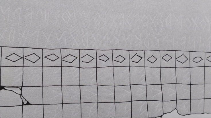
Someone asked me on twitter if I learn a lot from making drawings – I definitely do! I hadn’t previously realised that all these letter Os are quite different shapes from each other (what’s with the oval one on the right?). The grid lines also aren’t perfectly straight – they are clearly done by hand without any kind of ruler. The experience of tracing over those lines really made that clear to me for the first time.
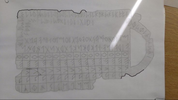
Here’s where I stopped for lunch – my print-out was all marked up, and I’d put some sticky notes next to areas where I thought I needed to check the photographs again for the final version.
After lunch, I started on the tracing. Top epigraphy tip: always start by doing a bit in the top left and a bit in the bottom right, whether you are tracing from a photograph or from the original inscription. This makes it much easier to re-align your paper if you move it by accident. If you try to realign using only stuff from one corner, you may well get into some problems! (This is a top tip from the BSA epigraphy course.)
The tracing paper was making the ink bleed too much, so I switched back to (thin) photocopy paper. I could still trace fairly easily through this, but also held it up to the light quite a bit. In the past, I’ve made an improvised light-box using a glass dish and torch, but I was at work today and sadly didn’t have any cooking implements available. (I would buy a real lightbox if I did this more often.)
At this stage, I was almost done – I just took a break to take a picture and catch up with a colleague. The tracing stage goes much more quickly than creating the first drawing, so I quickly finished off the final line.
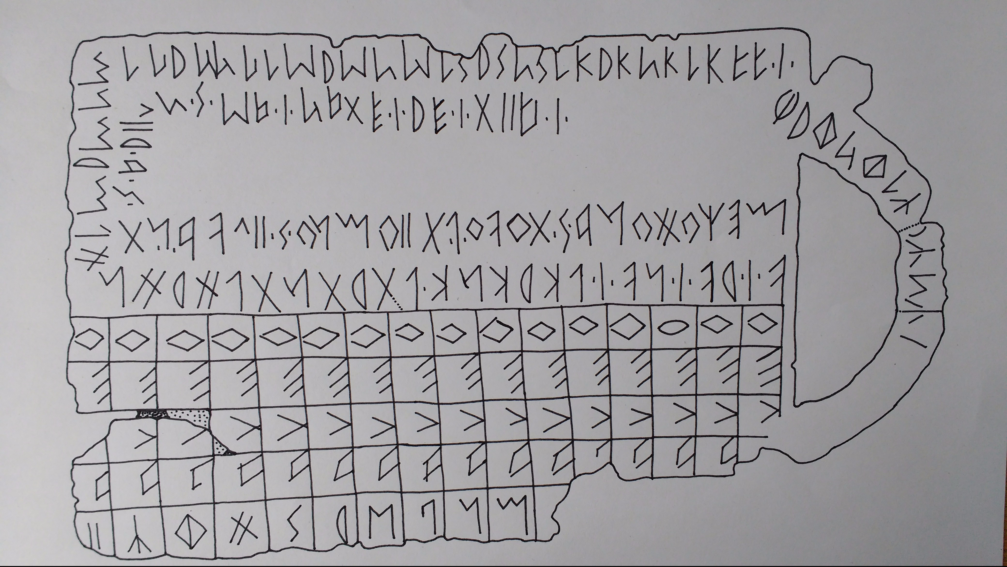
Here’s the finished product, just before I signed and dated it in the bottom corner. This is just a photo from my phone, but obviously it can also be scanned at high resolution, all ready to be used as an image in my article.
If you have inscriptions you’d like to draw for your work, I hope this reassures you that it is achievable! You need to be patient and not rush yourself, especially if you’ve not done it before, but at the end you have a great record and reference point for your work. It’s also makes for a really fun day at work.


Might not be practical for big inscriptions, but an alternative to buying a lightbox involves taping the photo to be copied and the tracing paper to a well-lit window (one on top of the other). The natural light will shine through the two pics and achieve a similar effect to a lightbox. The major downside is that this requires tracing to be done vertically, and it’s a bit cumbersome to flip the page around. But, for a small piece or detail of a larger project, I’ve found this to be an effective “lo-tech” solution.
LikeLike
Katherin, this strikes me as being a really interesting and useful posting. There’s always the feeling deep down that mechanical methods are the answer, but — just as with medical and botanical illustration — your method of hand-drawing the inscriptions adds an extra dimension beyond what the camera might show.
LikeLike